When I released the first version of mobile Anthropomotron, I had to design an icon for it. The process was described in these posts. Little did I know, that a major change in design aesthetics would occur, which would demand a change in both the design of the icon, and the app’s general interface as well. As mentioned innumerable times by the media in the fall of 2013, the visual style of iOS changed with the arrival of iOS 7. Gone was the “stylized reality†of the previous incarnations of the software, replaced by abstract simplicity.
As a side note, this is very much a pendulum shift, since back in the day (2000), there was a move spurred by Apple to go from stylized icons of Mac OS 9 to the large, colorful, and more realistic icons of OS X. This article has a great overview of icon style evolution.
Anyway, while I personally did not feel like changing the style of Anthropomotron, going with the flow and reworking the appearance has a few advantages. Even if the content is the same, staying in touch with what a modern app looks like gives a feeling of quality and professionalism. Also, not all change is bad, and being moved to make an overhaul in the user interface allowed me to fix and improve elements from the previous version. Following Apple’s official design guidelines to “interpret reality in an artistic way,†I went back to an idea I had when making the original icon to have the three objects (the femur, caliper, and ruler) be flat shapes.
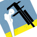
{ The mock-up I made while coming up with ideas. }
Working with the Photoshop file for the first icon, where I had kept all of the layers of the different elements, I quickly hid the textures from the old icon and made filled shapes for the three objects. Each object has little accent marks to more clearly show what they are supposed to represent. For some reason, the official iOS 7 designers love tick marks or other types of repeating lines (for example, pick up your nearest iOS device or see this webpage and look at the icons for Safari, Compass, Stocks, Voice Memos, and Settings), so I added such lines to the ruler and caliper. For the femur, I added lines to demarcate the femoral head and the intertrochanteric crest (I think the posterior femur has prettier lines than the anterior!). The official icons also have gradients for backgrounds so I got rid of the gridlines from before, noting the irony, and went for a blue-to-blue gradient that goes from the dark blue in the app’s UI to the light blue. For balance, the gradient is darker behind the white bone and lighter behind the black caliper.

Overall, I think the new icon has its own charm. I’m keeping the Photoshop layers of the old icon, though, for when the stylistic pendulum shifts back again.