I’ve noticed a few goofs in the professional comics I’ve read recently. Matt Fraction’s Hawkeye #1’s “fibia” was just the tip of the iceberg. Here are three that can be loosely filed under “laziness.” The respective teams involved really could have done a little bit more work to give the final product some polish.
Bryan Q. Miller’s Smallville comic is surprisingly good. Surprisingly, not because of the writer or artists, both of whom are doing fantastic work. (Miller and frequent collaborating artist Jorge Jimenez also worked on the Stephanie Brown Batgirl series mentioned in the last post). It’s that Smallville is based on the TV show of the same name, which let’s just say isn’t the highest quality television. Yet this creative team is making the best of it, taking many characters and plot elements from the show and building on that universe. Given how much I’m unexpectedly enjoying this book, it hurts even more when other people drop the ball.
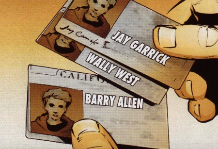
In this case it is the letterer, the person who adds text where it is necessary. In some cases, text is written or drawn directly into the art, but it is more efficient to fire up a vector art program like Illustrator and go at it. The problem is that vector art is a lot sharper than drawn art. The sharpness is great for speech balloons and sound effects since they should be clear to read and they don’t actually exist in the comic world, unless it is a fourth-wall-breaking story. For in-universe text, however, some effort has to be made to blend it into the rest of the art. Otherwise, text that should not stand out particularly much jumps off the page in a distracting manner:

Note how no effort was made to make the vibrancy of the text match the card it’s supposed to be printed on. Honestly, DC lettering does this all the time. In fact, this week’s issue of Batgirl (#18) has this:

What really got me about the Smallville example is the shadow the middle card casts on the bottom card. The text on the bottom card goes right over the shadow! Here is what around twenty minutes of Photoshop can do:

I did five things, one of which may have been unnecessary. I blurred the text to make it less sharp like the art it sits on. I decreased the lightness so it isn’t glaringly bright. I also decreased the saturation to take out some of the vibrancy (which wasn’t noticeable in the end). I painted the continuation of the middle card’s shadow over the bottom card’s text. Lastly, and what really sells the text, I painted some semi-opaque stains on the text to match the dirt on the cards. One thing I didn’t fix is how “Barry Allen” isn’t completely in perspective with the card it is on (compare the ‘B’ with border of the photo on the card). It’s not perfect; a professional can do a better job. But, I did a better job than an actual professional.
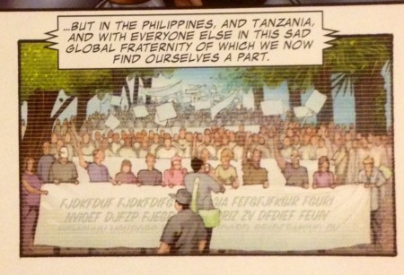
Case two is from the Marvel side. A friend lent me trades of Invincible Iron Man, coincidentally (?) also by Matt Fraction. In the comic there are a few vignettes of news coverage of worldwide protests. People looking angry, holding signs, and so on. I bet reading the signs would add a little flavor to what the protestors are feeling:

Or not. Unless this is some unique language in the Marvel Universe it looks like someone just went nuts with the keyboard. At least the text matches the banner it is on and is appropriately altered to look like it’s being viewed on a screen.
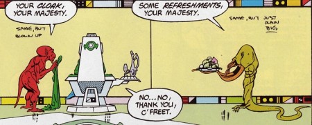
Lastly, here is a panel from a Legion of Super-Heroes comic from 1983, reprinted recently in a hardcover trade. The Emerald Empress is looking over a giant futuristic computer display that shows something that is “just plain big.” I mean literally, since no one ever replaced the instructions with the actual graphic in the 30 years since its first publication.
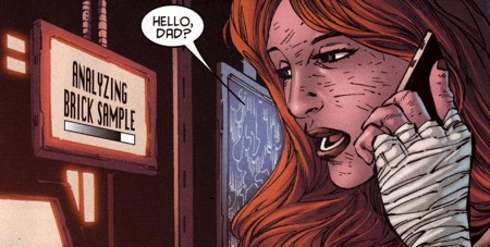
Update: This has been an especially bad week for lettering mistakes. Here’s one in the most recent Batman (#18) (is it just the current Bat-books letterer?? (nope, different people)).

I don’t even know how one can make a computer offset text like that!
