Several posts ago I wrote about how I tailored presentations based on my dissertation research to better suit the various audiences I’ve faced. As promised, here is a continuation of that post with another variation of the talk geared towards another type of audience.
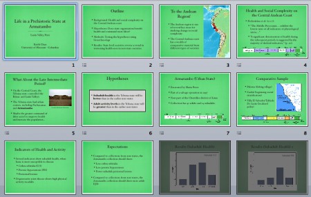
I gave the latest version of my defense presentation at the annual meeting of the Society for American Archaeology (SAA). As I’ve written before, I think the talk went well though double-booking reduced the size of my audience. Before I go into what I think went right when I made this talk, here is a look at the thumbnails for reference.
• The most obvious change is once again the color. I took the same textured background from Keynote’s Old Silk theme and made it green in Photoshop. Originally the green was more intense but I lightened and desaturated it to what you see here. I stopped tinkering when I saw that the green matched the map of South America, which brought the whole palette together.
• The SAA talk was supposed to be fifteen minutes long, five minutes shorter than the MCAAAE talk. I therefore had to cut more slides. Some of the results were cut, but most of the edits were once again in the opening slides.
• I was presenting in a session devoted to bioarchaeology so, unlike the MCAAAE audience, this crowd would most likely be experts in the study of skeletal remains but know almost nothing about the Andean region. I took out the slides describing the basics of bioarchaeology and instead started with an introduction of South America, narrowing down my talk to the Central Andean coast.
• The timeline that shows the chronology of Andean cultures is introduced earlier for people to refer to ask I talk about the different time periods.
• The list of sites in my comparative sample had its text shortened, replaced by a map of the region, so that the audience can make the links in space as well as time (via the timeline) in one slide.
• After all that finally is one slide listing the indicators of stress I examined. I took out illustrations because I figured that everyone in the room already know what they look like (though another presenter did show pictures later).
• The last slide before the results lists my expectations in a format that mimics the slide before it. Those following along should have a good idea of what my expectations were so I kept the verbal explanation short to get to the results.
I ended the talk two minutes ahead of schedule so I ad-libbed a minute of my plans for future research and preliminary interpretation of the results, material that I removed from the end. In hindsight I should’ve kept those final slides in the talk as my rehearsals were ending with one minute to spare, and the accompanying visuals would have tied the whole talk together. Still I was very happy with how my SAA talk turned out and I received some positive comments about my presentation.
Next: the end of the SAA 2011 series with a few random things that happened during the conference.
